


Web Components
Web Components 是一组由浏览器提供的技术,最早在 2011 年被 Google 提出,并在 2018 年 V1 版本开始被主流浏览器所支持。其中有很多概念和现代前端框架Vue、React等有相似之处(严重怀疑就是借鉴的😂)。Web Components 编写的组件并不区分框架环境,属于原生技术(HTML、CSS、JS),“一次编写终身可用”。
三个核心
Web Components 主要由三个核心技术构成:
Custom element(自定义元素):JavaScript API,允许定义 custom elements 及其行为,然后可以在用户界面中按照需要使用;
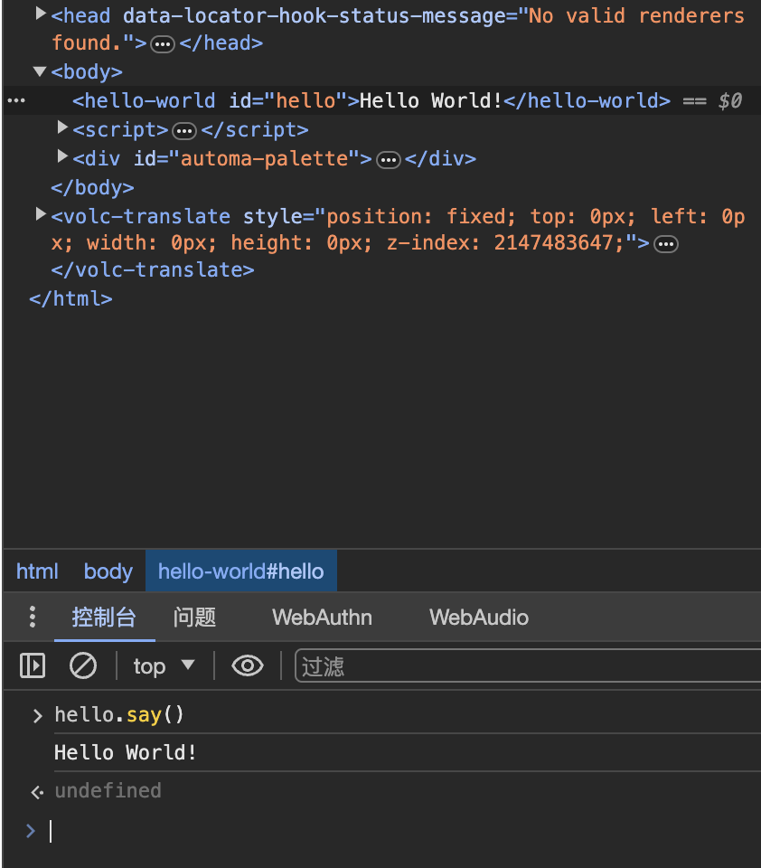
<body>
  <hello-world id="hello"></hello-world>
  <script>
    class HelloWord extends HTMLElement {
      constructor() {
        super();
        this.append('Hello World!')
      }

      say() {
        console.log('Hello World!');
      }

    }
    window.customElements.define("hello-world", HelloWord);
  </script>
</body>
通过ES6类语法为Web Components组件添加DOM元素及实例方法
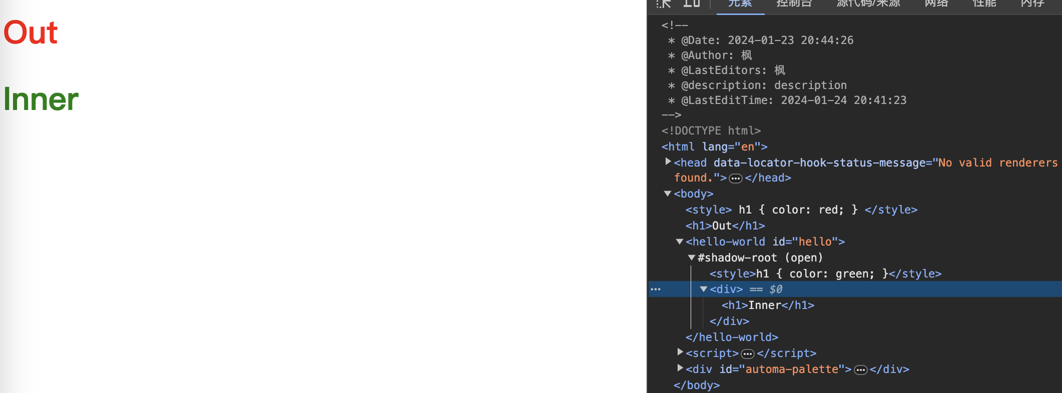
Shadow DOM(影子 DOM):JavaScript API,用于将封装的“影子”DOM 树附加到元素(与主文档 DOM 分开呈现)并控制其关联的功能。通过这种方式,可以保持元素的功能私有,而不用担心与文档的其他部分发生冲突,常见的
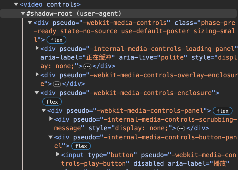
<video>和<audio>标签就是影子 DOM,内部有很多元素,但是没有在开发者工具中显示。<body> <style> h1 { color: red; } </style> <h1>Out</h1> <hello-world id="hello"></hello-world> <script> class HelloWord extends HTMLElement { constructor() { super(); const root = this.attachShadow({ mode: 'open' }); const style = document.createElement('style'); style.innerHTML = `h1 { color: green; }`; const div = document.createElement('div'); div.innerHTML = `<h1>Inner</h1>`; root.append(style) root.append(div) } say() { console.log('Hello World!'); } } window.customElements.define("hello-world", HelloWord); </script> </body>可以看到shadow dom内外的CSS是相互隔离的
HTML template(HTML 模板):通过
<template>和<slot>元素,可以编写不在呈现页面中显示的标记模板,可以作为自定义元素结构的基础被多次重用(如果用过Vue,会更容易理解这里),模板元素并不会渲染,但是可以背JS访问到。<body> <template id="tmplt"> <h1>Template</h1> <slot name="slot1">default slot1</slot> <br /> <slot name="slot2">default slot2</slot> </template> <hello-world id="hello"> <span slot="slot1">replace slot1</span> </hello-world> <script> class HelloWord extends HTMLElement { constructor() { super(); const root = this.attachShadow({ mode: 'open' }); const content = document.getElementById("tmplt").content.cloneNode(true); root.append(content) } say() { console.log('Hello World!'); } } window.customElements.define("hello-world", HelloWord); </script> </body>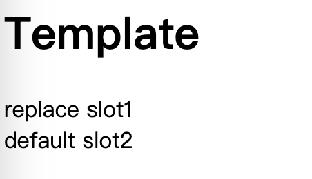
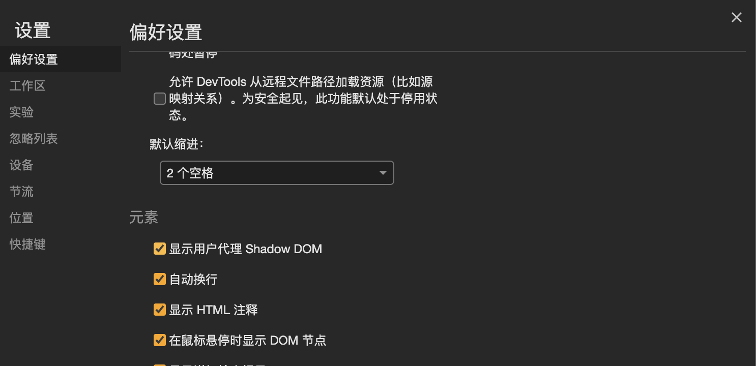
如果想要查看内置 Shadow DOM 元素,可以在 Chrome 开发者工具中开启
开启后video标签会变成以下内容
⚠️:如果Web Components解析失败,则会被当作普通div元素处理。
stencil
了解了Web Components之后会发现,虽然挺有诱惑力,但是应付起现代的前端需求还是比较吃力的,所以有了Stencil框架,可以帮助开发者更方便快捷地开发Web Components组件。
初始化
使用包管理工具来初始化项目
$ pnpm create stencil
选择要初始化的项目类型(通用组件、快速搭建应用程序或网站、PWA应用)
? Select a starter project.

Starters marked as [community] are developed by the Stencil
Community, rather than Ionic. For more information on the
Stencil Community, please see github.com/stencil-community

❯   component                Collection of web components that can be
                             used anywhere
    app [community]          Minimal starter for building a Stencil
                             app or website
    ionic-pwa [community]    Ionic PWA starter with tabs layout and routes
然后输入项目名称
✔ Pick a starter › component
? Project name › stencil-study
此时项目已经初始化完成,安装依赖就可以运行项目。

项目结构
通过脚手架初始化的项目结构如下
.
├── LICENSE
├── node_modules
├── package.json
├── pnpm-lock.yaml
├── readme.md
├── dist 									// 资源打包目录,包括多种模块化方案的编译结果
├── loader 								// 对应资源的加载器
├── src
│   ├── components 				// 组件目录
│   │   └── my-component
│   ├── components.d.ts
│   ├── index.html 				// dev 环境入口文件,启动后会被copy到www目录下
│   ├── index.ts
│   └── utils 						// 工具函数目录
│       ├── utils.spec.ts
│       └── utils.ts
├── stencil.config.ts 		// stencil 配置
├── tsconfig.json 				// ts 配置
└── www 									// 开发过程中启动服务器所用的资源目录
如果要新增组件,可以使用命令生成
╭─ ~/worksapce/study/stencil-study
╰─❯ npx stencil generate sten-button
[32:42.6]  @stencil/core
[32:42.7]  v4.11.0 🍝
✔ Which additional files do you want to generate? › Stylesheet (.css), Spec Test  (.spec.tsx), E2E Test (.e2e.ts)

$ stencil generate my-button

The following files have been generated:
  - src/components/my-button/my-button.tsx
  - src/components/my-button/my-button.css
  - src/components/my-button/test/my-button.spec.tsx
  - src/components/my-button/test/my-button.e2e.ts
可以通过插件引入CSS预编译工具,安装@stencil/sass依赖,然后在配置文件中添加插件,就可以使用scss编写样式了。
import { Config } from '@stencil/core';
import { sass } from '@stencil/sass';

export const config: Config = {
  namespace: 'stencil-study',
  //...省略部分配置
  plugins: [
    sass(),
    // 使用插件,sass配置见文档:https://www.npmjs.com/package/@stencil/sass
  ]
};
组件
Stencil最核心的API就是它的各种装饰器,通过ES2017的装饰器语法、面向对象编程搭配TSX语法,可以极大地提高编写组件的效率。(Angluar的注解,React的JSX语法,Vue的slot等语法,一眼看去将各种前端主流框架“抄”了一遍😂)
@Component
用于定于一个Web Components组件,接受一个对象参数,tag(string)为必填项标识要解析的标签,styleUrl(string)声明当前组件的css文件路径,shadow(boolean)控制是否开启shadow root,其他属性见文档。
@Component({
  tag: 'my-button',
  styleUrl: 'my-button.scss',
  shadow: true,
})
export class MyButton {
  render() {
    return (
      <Host>
        <button>
          <slot></slot>
        </button>
      </Host>
    );
  }
}
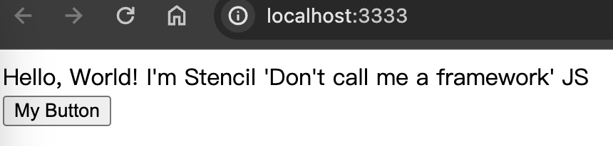
上面我们定义了一个<my-button>组件,渲染为一个button按钮
@Prop
用于声明当前组件 element 元素上的属性,可以自动解析DOM attributes到Class property,方便开发时使用。
@Component({
  tag: 'my-button',
  styleUrl: 'my-button.scss',
  shadow: true,
})
export class MyButton {
  @Prop() type: 'default' | 'primary' = 'default';

  render() {
    return (
      <Host>
        <button class={this.type}>
          <slot></slot>
        </button>
      </Host>
    );
  }
}
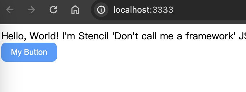
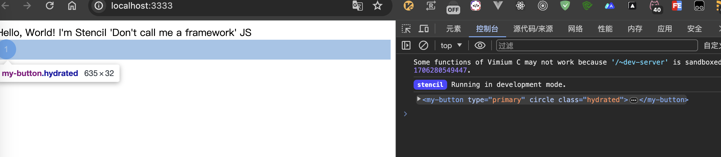
基于刚才的组件雏形,我们进行了完善,通过type属性设置button的默认样式(已经在my-button.scss中编写样式)
@State
定义组件内的数据,当期望数据变化引起重新渲染时,使用@State注解声明,如果确定某些值的更新不需要触发页面的变更,则不需要使用@State修饰。
@Component({
  tag: 'my-button',
  styleUrl: 'my-button.scss',
  shadow: true,
})
export class MyButton {
  @Prop() type: 'default' | 'primary' = 'default';

  @Prop({ attribute: 'circle' }) isCircle: boolean = false;

  @State() count = 0;

  render() {
    return (
      <Host>
        <button
          class={classnames(this.type, { circle: this.isCircle })}
          onClick={() => {
            this.count++;
          }}>
          <slot></slot>
        </button>
      </Host>
    );
  }
}
需要注意的是,对象和数组若要触发渲染,则需要创建新的对象和数组,如果直接push不会引起重新渲染,因为内存地址没有改变。
@Watch
类似于Vue中的Watch,可以用于监听Prop和State,当目标改变时触发回调,可以方便开发者将交互和副作用解耦。
@Component({
  tag: 'my-button',
  styleUrl: 'my-button.scss',
  shadow: true,
})
export class MyButton {
  @Prop() type: 'default' | 'primary' = 'default';

  @Prop({ attribute: 'circle' }) isCircle: boolean = false;

  @State() count = 0;

  @Watch('count')
  countChanged() {
    console.log(this.count);
  }

  render() {
    return (
      <Host>
        <button
          class={classnames(this.type, { circle: this.isCircle })}
          onClick={() => {
            this.count++;
          }}>
          <slot></slot>
        </button>
      </Host>
    );
  }
}
@Element
解析Web Components时会将组件根元素绑定到@Element修饰的变量上,可以通过此变量使用标准DOM的方法和属性
@Component({
  tag: 'my-button',
  styleUrl: 'my-button.scss',
  shadow: true,
})
export class MyButton {
  @Prop() type: 'default' | 'primary' = 'default';

  @Prop({ attribute: 'circle' }) isCircle: boolean = false;

  @Element() el: HTMLElement;

  constructor() {
    console.log(this.el);
  }

  render() {
    return (
      <Host>
        <button
          class={classnames(this.type, { circle: this.isCircle })}
        >
          <slot></slot>
        </button>
      </Host>
    );
  }
}
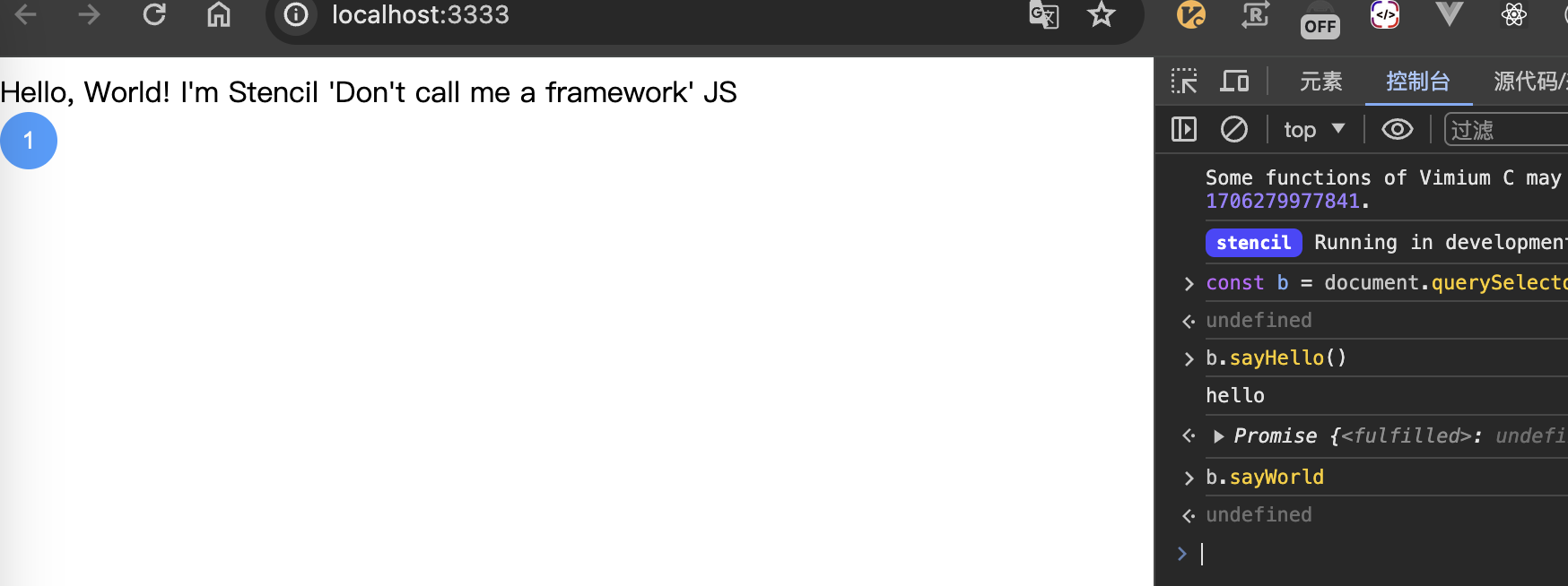
@Method
使用@Method修饰的方法会暴露给组件实例,⚠️对外暴露的方法必须标记为异步(async),私有有方法则没有这个要求。在外部调用暴露方法之前需要将Web Components注册。
@Component({
  tag: 'my-button',
  styleUrl: 'my-button.scss',
  shadow: true,
})
export class MyButton {
  @Prop() type: 'default' | 'primary' = 'default';

  @Prop({ attribute: 'circle' }) isCircle: boolean = false;

  @Method()
  async sayHello() {
    console.log('hello');
  }

  sayWorld() {
    console.log('world');
  }

  render() {
    return (
      <Host>
        <button
          class={classnames(this.type, { circle: this.isCircle })}
        >
          <slot></slot>
        </button>
      </Host>
    );
  }
}
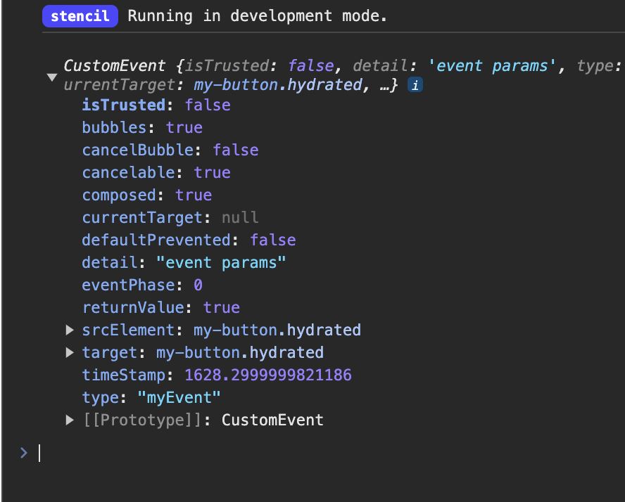
@Event
用于推送事件和派发数据,声明Event之后可以通过emit方法来触发事件,自定义事件可以和@Listen搭配使用。
@Component({
  tag: 'my-button',
  styleUrl: 'my-button.scss',
  shadow: true,
})
export class MyButton {
  @Prop() type: 'default' | 'primary' = 'default';

  @Prop({ attribute: 'circle' }) isCircle: boolean = false;

  @Event() myEvent: EventEmitter<string>;

  render() {
    return (
      <Host>
        <button
          class={classnames(this.type, { circle: this.isCircle })}
          onClick={() => {
            this.myEvent.emit('event params');
          }}
        >
          <slot></slot>
        </button>
      </Host>
    );
  }
}
@Event注解可以接受一个对象参数,内容如下
export interface EventOptions {
  // 用于覆盖默认值自定义事件名称的字符串。
  eventName?: string;
  // 用来设置事件是否通过 DOM 冒泡的布尔值。
  bubbles?: boolean;
  // 设置事件是否可取消的布尔值。
  cancelable?: boolean;
  // 一个布尔值,指示事件是否可以跨越 shadow DOM 和常规 DOM 之间的边界冒泡。
  composed?: boolean;
}
@Listen
用与添加事件监听,在Stencil组件内部可以监听自组件派发的事件,有多种方法可以实现监听器的绑定。
第一种方法,在组件内部添加监听
@Component({
  tag: 'my-card',
  styleUrl: 'my-card.scss',
  shadow: true,
})
export class MyButton {
  // 方法一
  @Listen('myEvent')
  myEventHandler(e: CustomEvent) {
    console.log(e.detail);
  }

  render() {
    return (
      <Host>
          <slot></slot>
      </Host>
    );
  }
}
第二种方法在使用组件时添加绑定
<my-button onClick={e => console.log(e.detail)}>
  click
</my-button>
第三种方法就是在使用DOM事件添加监听器
const btn = document.querySelector('my-button');
btn.addEventListener('myEvent', e => console.log(e))
生命周期
同其他框架一样,Stencil也是有生命周期钩子的
- connectedCallback():每次组件连接到DOM的时候调用;
- disconnectedCallback():组件与DOM断开连接时调用;
- componentWillLoad():组件第一次连接到 DOM 之后调用一次;
- componentDidLoad():在组件完全加载并第一次调用
render()后调用一次; - componentShouldUpdate():当组件的
Prop或State属性更改并且即将请求重新渲染时,将调用此钩子,返回一个布尔值控制组件是否重新渲染,类似于React的shouldComponentUpdate; - componentWillRender():每次调用
render()之前调用; - componentDidRender():每次调用
render()之后调用; - componentWillUpdate():组件即将更新时调用;
- componentDidUpdate():在组件更新后立即调用。

如何在其他框架中引入
以React为例,安装@stencil/react-output-target 依赖用于构建React加载器,在配置文件中添加以下配置
import { Config } from '@stencil/core';
import { reactOutputTarget as react } from '@stencil/react-output-target';

export const config: Config = {
  namespace: 'stencil-study',
  outputTargets: [
    react({
      componentCorePackage: '@feng-j/stencil-study',
      proxiesFile: './dist/react/index.ts',
      includeDefineCustomElements: true,
    }),
    // ......
  ]
};
componentCorePackage 用于生命依赖包(当前组件库的npm包名),proxiesFile制定加载器输出位置,我这里选择将加载器防到了包产物里面,最终的效果如下
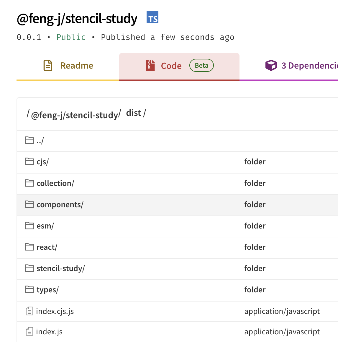
react目录就是加载器,在React项目中引入一下看看
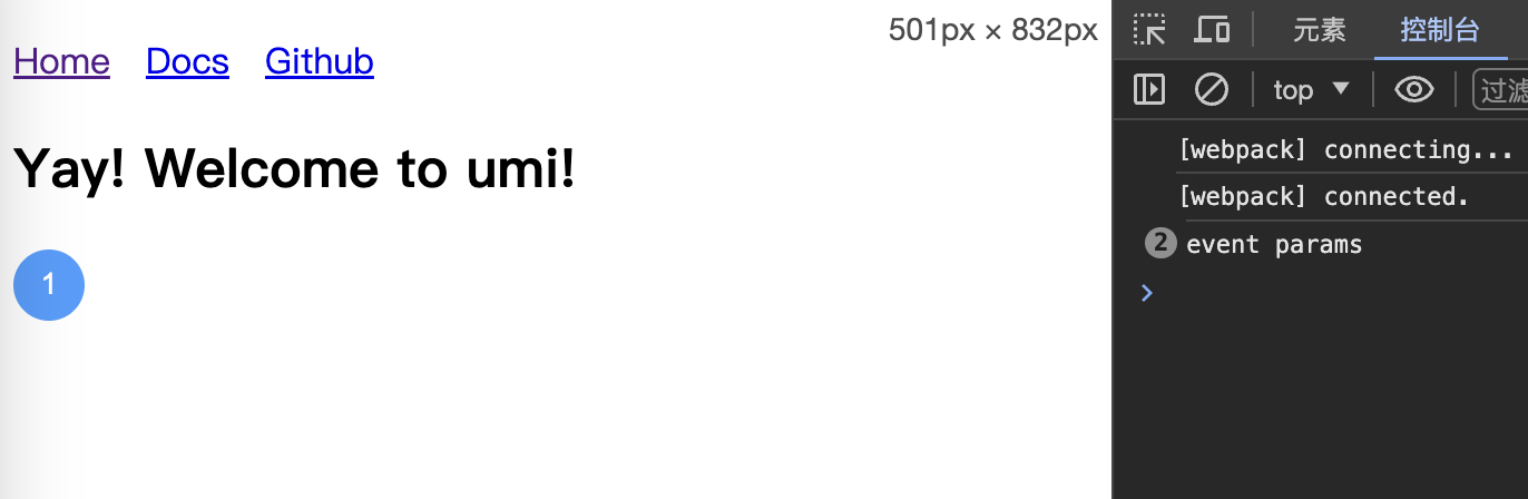
import yayJpg from '../assets/yay.jpg';
import { MyButton } from '@feng-j/stencil-study/dist/react';

export default function HomePage() {
  return (
    <div>
      <h2>Yay! Welcome to umi!</h2>
      <MyButton type='primary' circle>1</MyButton>
    </div>
  );
}
可以看到还是我们之前的效果
其他框架的引入方式见文档。
总结
Web Components还是一个挺让人激动的技术,未来也可能是一个趋势,可以减少一部分的开发工作。Stencil这个框架虽然功能听挺多,但是真正实用的功能也就是组件库开发了,业务开发使用Stencil的话还是非常不方便的,纯Web Components开发业务是很不方便的,组件的关系不使用模块加载会很乱。